Showing posts with label London. Show all posts

Monday, 2 January 2012

Urban Trawl: The City


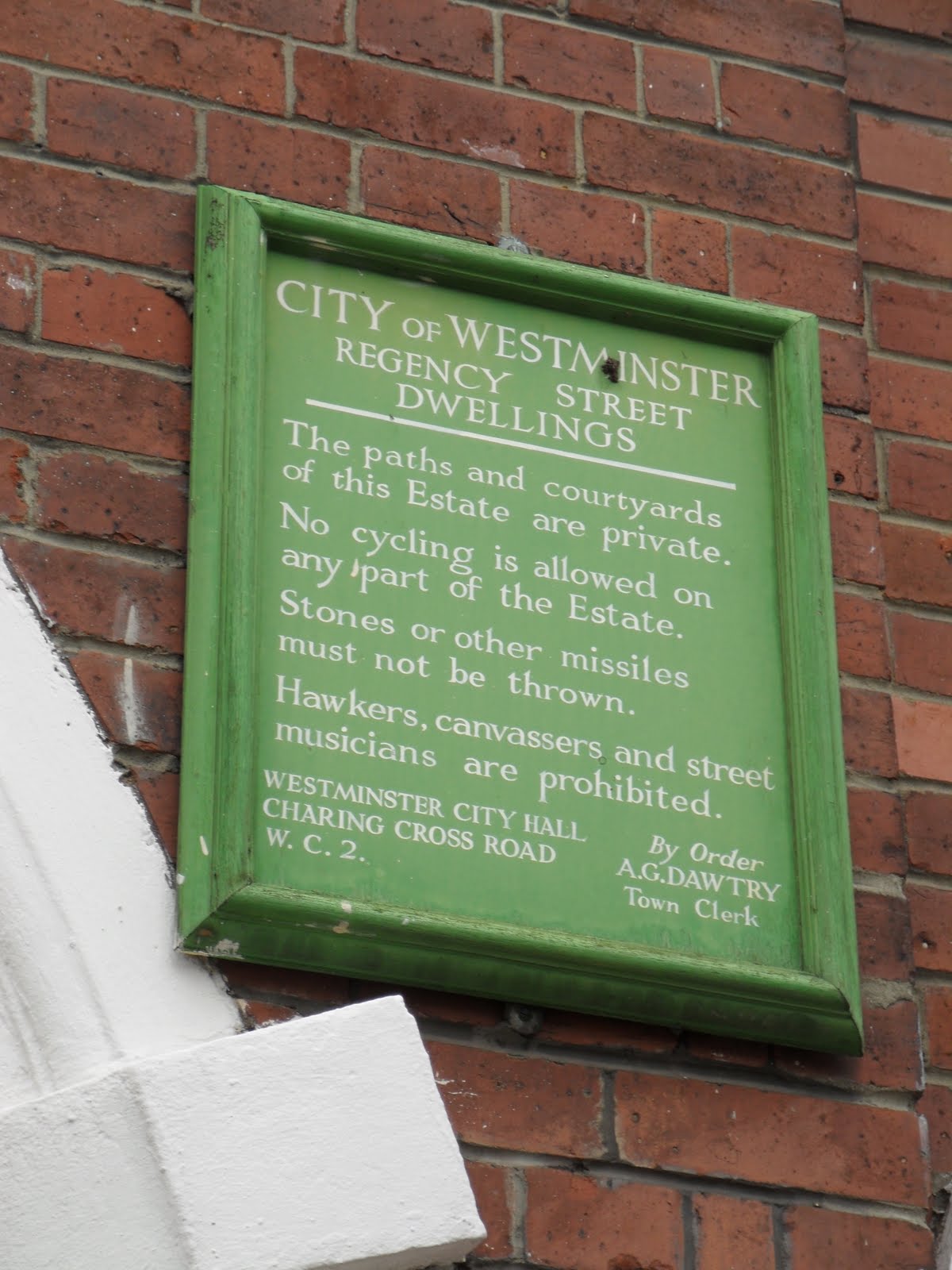
If you looked up above St Paul's Cathedral in the early afternoon of the 9th November, you could have counted at least three helicopters. Their deafening spiralling nearly drowns out what is happening below. They're the result of the ruthless over-policing of the slight return of last winter's student protests, currently marching nearby in Moorgate. This made the 9th a perfect day to explore this neurotically protected citadel of undead financial capitalism. Encircling St Paul's is Paternoster Square, or more specifically Juxon House, a nasty, Vegas via EUR via Duchy of Cornwall neoclassical superblock. In the last decade of pseudomodernism, this development has always stuck out for its kitsch revanchism, bolting onto itself Wren's Temple Bar, retrieving it from a garden in Enfield and plonking it a long way from the Temple itself. There's a ghost of a town planning idea in these Rossi-goes-to-Reading banks and offices, in the way they enclose the great dome with a series of narrow byways. Nonetheless this has long been one of 21st century London's most depressing, smugly jolly spaces. Not now, though.


The silly mock-pathetic columns of Juxon House, each topped by a broken, blank-eyed Grecian head, were covered on November 9 with an architecture more parlante – hundreds of small posters, flyers, messages, notes, manifestos, declarations. 'GENERAL STRIKE!' reads the aptest, with a wild-eyed cat below. 'THE BEGINNING IS NIGH!' reads one. 'BEAUTY IS IN THE STREET' another, which is quite Urban Renaissance of them, though the poster's image of a barricade-laden thoroughfare is not very Urban Splash – and nor is the highly developed public infrastructure of the camp they look out on. In tents large and small are a University, Welfare centre, Clinic, Restaurant, Public Toilets (the latter especially unusual in contemporary London). The tents themselves are a Drop City of simple, curvilinear frames with multicoloured tensile artificial fabric – high-tech, though their users might not always think so. A line of armoured riot police, shields and truncheons at the ready, stand at the other side of Temple Bar, with a pastiche of the Monument in the background. As an example of detournement, a subverting of private space into public space, you really couldn't do better; it's a wonderful irony that the square's part-ownership by the Church has meant that the encampment is at Paternoster Square, of all places (though there are subsidiary camps at the time of writing in Broadgate and Finsbury Circus). It's the most exciting thing to happen to the City of London since the Lloyds' Building. Or the fire.


The City is our last Urban Trawl, and it is the smallest and oldest place to be covered; the Roman colonial city that became English capital that became strange, depopulated autonomous centre of gentlemanly finance, or rather the expression in space of the British Empire's funding system. Since 1986 it has taken on another life. Still not residential, still unencumbered by representative democracy or common law, the City has become the fulcrum of a system of offshore, unregulated finance, sprouting colonies on the Isle of Dogs, Borough, Holborn (sorry, 'Midtown') and elsewhere. It is Old Corruption in 'transparent' braced glass. The place where Lehman Brothers did the things that even Wall Street wouldn't let them do. The heart of darkness at the root of the UK's malaise. Everything from slavery to suburbanisation, imperialism to deindustrialisation, can be traced to here. It is a place which has long deserved a serious reckoning.


It's also, and this should be somewhat shaming, perhaps the most coherently planned city in the UK of last 20 years. This is obviously something of a negative virtue. Compared with the planning of the inner areas of Birmingham, Edinburgh, Glasgow, Manchester, Bristol, Peter Rees' tenure can be seen as a relatively benevolent despotism. New City buildings boast expensive materials, fine detailing, and sometimes a degree of wit and imagination in their adaptation to the old City's courtyards and alleyways. There's roughly one success to one howler; Eric Parry's elegantly stern Wood Street or Jean Nouvel's lumpen shopping mall; OMA's site-specific raised box or Foster's Rhinoceros round the corner; Levete's blinging neo-Seifert or the well-placed Salvation Army headquarters. Even the bad buildings here have a sensitivity of massing and materials that is deeply unusual in Britain. The Devil doesn't necessarily have the best buildings, but he can afford slightly more civilised ones. Don't think too hard about what goes on inside and there's something to grudgingly admire. But needless to say, nobody has animated the City's malevolence with the demented extravagance of Lloyds, a building which seemed to scare Rogers and his clients into 25 years of worthy sententiousness.


That might sound counter-intuitive given the City's obvious vertical emphasis of late. Its new skyscrapers, adjoining or replacing Seifert or Gollins Melvin Ward's more sombre '70s efforts, are the result of Ken Livingstone's failed Faustian Pact in the early '2000s – skyscrapers for Section 106 agreements, a manifestly misguided attempt by a GLA without tax-raising powers to finance new social housing, resulting in a few 'affordable' studio flats slotted behind waterside yuppiedromes. The architectural results here too are often fair as these things go – American corporate modernism made more interesting by being slotted at random into the medieval street plan, creating strongly memorable accidental vistas. SOM's Bishopsgate Tower is ruined by its height restrictions, squat where it should be sweeping, but KPF's Heron Tower is less compromised. The Gherkin still feels barely corporeal up close, like a piece of GGI. And in typically, the new domestically-named towers under construction will entail both Vinoly's whimsical 'Walkie-Talkie' and Rogers' more rigorous 'Cheesegrater'. Seen from, say, the viewing area of Tate Modern, the new City skyscrapers compare well with Canary Wharf's axial beaux-arts boredom. But it's hard to ponder their architectural qualities in the face of the fact that, despite the bailouts, despite capsizing capitalism, the City is merrily going on as if nothing had happened. If you want to know why OccupyLSX is necessary, consider the fact that the public purse funds the City's new generation of financial phalli, while they squeal against a Tobin tax.


These new towers also have to replace something. Accordingly it is the architecture of the recent past that must go, from the attractive if privatised postmodern agora of Broadgate to Seifert's sinister, insufficiently cuddly corporatism. More sadly, there's the curbing of the walkways strung across the City after Patrick Abercrombie, which added another layer of topographical interest to the tangle of alleyways, byways and churchyards. Yet The City hasn't quite tidied up its edges yet. Sometimes it colonises them, with alarming effect – Foster's unforgivable emasculation of Spitalfields Market, Grimshaw's weirdly '80s blue-glass homunculus creeping up to Aldgate, and most obviously, the leap cross-river into Borough, in the form of Piano's Shard. It's arguably impressive from a distance, but shockingly overscaled at ground level. Elsewhere the border is a harsh them-and-us; the Griffins overseeing the faded technocratic murals of Telephone House or the rotting carcass of Smithfield. There are two moments, though, when the City meets the seeming antithesis of the rapacious capitalism it embodies and propagates.


Middlesex Street, 'Petticoat Lane', is full of public housing, from interwar tenements to a remarkable mini-Barbican of walkways and towers. It's a sudden plunge right into real London, and vies with Poplar for the sharpest meeting of rich and poor in Europe. These places were largely owned by the LCC, now Tower Hamlets, and hence are left to rot. The City's own postwar housing projects, however, are still a revelation. It's incredible at this distance to think that the City could have paid for Golden Lane, for instance, a place where evidently some of London's working class manage to live well next to architects who are paying over the odds for the same flats. The Barbican, into which it imperceptibly fades along Goswell Lane, is a more complicated proposition, never public housing in the strict sense, although certainly not intended as the luxury enclave it is now. The Barbican, aside from the sheer pleasure of its Brutalist-Baroque grandeur, is mainly of use for deflecting every anti-modernist, anti-urban shibboleth going – a high density arrangement of towers and walkways, without an inch of 'defensible space', in beefy raw concrete, that is doing very well thank you (it's also, like the City itself, a wonderful place to get yourself deliberately lost on a Sunday).


If there is hope in the City, it's in the conjunction of these two estates and the camp at Paternoster Square. Here the latter's direct democracy, their egalitarianism and anti-capitalism might lose its anti-industrial biases, their Transition Town off-grid narcissisms, and encounter the sensitively planned, egalitarian, modernist, industrial architecture of the Barbican and Golden Lane. That encounter urgently needs to happen. It is potentially where the future of British architecture and urbanism lies, if it is not to remain the elegant exterior decoration of evil.

(Originally published in Building Design, 24 November 2011; photo set of the City here.)

Monday, 12 September 2011

Viddy Well


Things has said some unexpectedly nice things about the photographic arm of this series/blog/book/project, so here's a few sets for your delectation that are otherwise unwritten-up. Lincoln, Leicester, Wakefield, Newport, Brecon, Cardiff, Catford, Eltham, Stratford, Edinburgh, Leith, Kew, Bournemouth. Most or some of these will be written about properly sooner or later.

Wednesday, 13 July 2011

Unison Building, Euston Road


Although they don't, funnily enough, tend to be considered part of the Big Society, Trade Unions are still, by an overwhelming margin, the largest civil society organisations in the UK. The Unions are voluntary, democratic, mutual, bottom-up, and yet they're the very obverse of 'localism', philanthropy and the other current shibboleths. Membership might have declined since its late 1970s peak, and a series of amalgamations might have swallowed up many of the once-influential unions, with even the fearsome Transport & General Workers Union absorbed into the most recent of them, Unite – but Union membership still stands at seven million, which puts the much-vaunted likes of, say, London Citizens in the shade. And paradoxically, the frontal attacks on public sector unions from the coalition has revealed their unexpected strength, whether in the half a million who marched in London on March 26 or the 750,000 or so strikers who walked out last week. The largest, along with Unite, of today's amalgamated super-unions, the public sector union Unison have just begun occupying the first purpose-built trade union headquarters to have been erected in the UK for nearly thirty years. While as a piece of architecture it's quite deliberately unspectacular, Squire and Partners' building shows a face of the trade union movement that is seldom seen. The stereotypes of donkey jackets, gavel-bashing and intense masculinity are wholly absent – instead, this is quite consciously an exercise in branding and modernisation. It suggests what the 1997-2008 era's Blairite buildings might have been like if Labour had remained a socialist party. It's a fascinating, occasionally rather inspiring place. But the first thing to note about the Unison building is what it is not.

Oddly, given their once-central and still key role in British political life, trade unions have not always been major sponsors of architecture. The most famous of them is in central London, in the form of David Aberdeen's Congress House for the TUC, a very expensively detailed Corbusian palazzo, with its Jacob Epstein sculpture and craftsmanlike finishes. It is one of several in the Bloomsbury/Kings Cross area, near to the termini serving the North and the Midlands, traditionally the unions' strongholds. Even now, the NUJ, Unite and others are nearby. Also in the area is the original headquarters of the National Union of Mineworkers, a stripped classical building now occupied by University College. The NUM moved out of here even before their fateful defeat in the Miners Strike of 1984-5, to a purpose-built headquarters designed by Malcolm Lister – relocated to Sheffield, as a gesture of distrust to Union leadership's tendency to get cosy with the Great Wen. It was left unfinished at the end of the strike. Unison's tower is almost certainly the first of its kind since then. It even has the odd stylistic similarity, with both centring on severe columns as a slightly strained metaphor for mutual support. It's worth remembering that Dave Prentis, the head of Unison – not a leader who is exactly known as a firebrand – has said of the current wave of public sector strikes that it will be unlike the Miners strike, as 'this time, we'll win'.

The air of siege and conspiracy that all this might imply is conspicuous by its absence; no union barons or smoke-filled rooms to be seen. Michael Poots, the project architect at Squire and Partners, talks of it as a 'corporate headquarters'; Unison's site manager John Cole speaks of a 'bold high street frontage', and both talk about it as a form of branding, a statement of what trade unions are in the 21st century. Cole contrasts it with the office block Unison previously occupied just across the road – a large, slit-windowed, Gorilla House concrete tower which he refers to as 'the East European grey concrete building'. The union had considered moving to the City of London (before deciding that 'culturally, it didn't quite fit'), but decided to stay near to other unions and to the termini for the North. But happenstance has meant that the new Unison building directly faces the old.

Originally designed for the local government union NALGO, one of those that merged into Unison, Cole says of it now that 'it was basically a concrete tower block', although this is also a fair description of the most obvious element in the new Unison building. To the Euston Road, it is a concrete-clad, steel-framed tower, with a mild case of the barcode façades and a rhythm of different window heights; but this becomes more complex at the rear and the side, where that corporate symbol, a glass atrium, links it to the listed Arts & Crafts Elizabeth Garrett Anderson building, a former women's hospital, and at the back, a small cluster of housing. It's a complex more than a singular building, although this is hardly apparent from the laconic street frontage, where the most notable moment is the aforementioned branding. A large UNISON logo at the top and at the entrance, making the purpose-built nature of the project apparent, and announcing the union's public presence.

The main bulk of the complex is the office block in the tower, spilling into the Elizabeth Garrett Anderson building, and curiously it's here that the difference between this place and any other corporate headquarters is most apparent. On one level, it's a question of rhetoric. You find the brightly coloured sloganeering that adorned some Blairite structures, but the content is very different. Instead of, say, AHMM's Westminster Academy and its Mandelsonian mantra of 'Enterprise, Global Citizenship, Communication', each room features the rather more meaty, contentious 'Solidarity, Participation, Democracy, Equality'. What would once have been called 'improving quotations' are also littered around the building, inscribed into glass doors and internal windows, with 'everything from Mahatma Gandhi to Billy Bragg'. Most memorably, given that the UK has, as Tony Blair once proudly pointed out, the most repressive labour laws in the western world, one wall comes via Michael Foot: 'most liberties have been won by those who broke the law'. All this heated (albeit soft-toned and lower-case in the graphic design) rhetoric has to have some sort of correspondence to how the building actually functions. Given that the organisation exists at least in part to fight for better working conditions, it had to be 'an exemplar working environment' And here Unison are clearest about the old NALGO building's limitations. Dark and lit by artificial light, John Cole also points out that it had 'no social spaces'. Instead, the union 'wanted large floor plates' in order to be able to create these areas. In the concrete tower block, there's a very pleasant roof garden, a cafe, a creche, a 'breakout room' and much else. In design terms, these aims are compromised a little by the rather cold, identikit corporate detailing. Cole comments that opulence was out of the question, as 'we have lots of low-paid members' (something that certainly didn't deter the designers of Congress House in the 1940s) but there's no doubt that they work. When walking around it I chance upon a small office get-together, with crisps and what is (euphemistically?) described as 'juice'. One comments that in three days there, she'd met six fellow Unison employees she'd never met before. 'It shows how a building can change things'.

Most of the workers I saw here were women, and the building seems to – perhaps inadvertently – reflect where Unions are currently strongest, in poorly-paid but traditionally 'white-collar' jobs, largely female, and highly computer-literate. In the face of accusations that unions are lumbering pre-modern dinosaurs, Cole proudly points out that Unison has the the largest intranet in Europe, and Michael Poot lists with equal pride the building's impeccable environmental credentials. Given the evident successes of the internal arrangement, the lightness and airiness of the place, it's a shame that its design language stays at such a low voltage.

That's something which becomes especially clear with the transition to the Elizabeth Garrett Anderson building. This late 19th century hospital was closed in 2002, with its functions transferred to nearby UCH. The complex entailed a complete restoration of its much smaller, cosier rooms, with the original tiles and fireplaces scrupulously pieced back together. Sometimes this leads to enjoyably surreal juxtapositions, as when a vaguely art nouveau fireplace sits unused in the corner of a video conference room. Irrespective of the TUC's brief foray into high modernism, the most famous visual image of trade unionism is deeply Arts and Crafts-influenced – the embroidered trade union banners that are still carried on marches, where the aesthetics of William Morris socialism, in a pre-branding era, still have a vivid emotional role. Framed with foliage, symmetrically organised and allegorical, sometimes you even find architectural modernism immortalised on them. One RMT banner I spotted on a protest a few months ago was centred on an image of Charles Holden's Arnos Grove station. This powerful language is at least partly present in the Elizabeth Garrett Anderson building. In its main room, which is being adapted as a museum, with interactive exhibits on feminism, the health service and trade unionism, there is remade arts and crafts furniture (that you can sit on, for once!) and a small library, featuring the likes of Friedrich Engels, Mary Wollstonecraft, Sheila Rowbotham. If the rest of the building avoids the traditional notions of what trade unionism looks like, here there's a reminder, and its a quietly powerful one. Perhaps this is a project which needed rhetoric and imagery as much as clarity and spaciousness. While Squire and Partners clearly took the place very seriously, a more nonconformist firm might have reconciled the traditional and forward-looking impulses of the union in a more forthright, convincing, dialectical way. Instead, the pretty but mute faceted roof of the atrium provides the main connection.

The atrium also leads the way towards the housing that was demanded by planning – deceptively so, as there is no public access. It's a decent, unspectacular, stock brick scheme of houses and flats, 'mixed' as ever, and clearly demarcated between the private element facing one way and the 'social' side the other, with both quite aggressively gated from the street. Here, you're reminded that the context is the redevelopment of Somers Town and Kings Cross, a working class industrial area of dense council housing undergoing severe gentrification, from HOK's BioMed Centre behind the British Library, that was fiercely opposed by local campaigners who pointed out that the site was zoned as social housing, to the new St Pancras International and King's Place. It's the sort of area where unions used to thrive, being completely transformed. The Unison building shows trade unionism transforming in turn, and in that, it's an optimistic, encouraging building, an enclave of sobriety and solidarity in amidst the regen tat. It stands its ground, quietly – but in terms of what happens inside, this might well prove to be one of the more influential recent buildings in London.

Originally published in Building Design, 6/7/11

Monday, 27 June 2011

Urban Trawl: Croydon


The suburbs are back, this we know. Ever since Boris Johnson's 'Zone 5 Strategy' reminded everyone how successful a politician can be by appealing to the Free Born Englishman's age-old right to drive at 4 miles an hour rather than taking a bus, the Party of government has explicitly favoured suburban, south-east England, especially as the North becomes even more hostile to it. Croydon may be a typical slice of the London/Surrey grey area that has been a conservative bastion for over a century. Why is it, then, that the first impression a stranger might have of the centre is of a large, dense, multicultural, independent provincial city? Why does the London Borough of Croydon so much want to be a City itself? And what can we learn about what a 'suburb' really is from this place?


If it ever gets its long-stated wish of becoming officially 'urban', this quintessential commuter suburb will become a city of above average size, roughly the size of, say, Coventry, or Hull. It has its own rapid transport system and it's own rather particular pattern of urbanism, both of which are lacked by many official British cities. Many will be familiar with the strange sight that hits you when leaving East Croydon station – with the trams and high-rises, you could believe you were in a wealthy West German industrial city, until you walk around a little. What you find on investigation is that Croydon is in fact very English indeed, a result of the subjugation of planning to commerce. In short, what happened here in the 1960s is that an ambitious council offered businesses cheap office space if they would fund infrastructural improvements. Within an astonishingly short time, they transformed a burb into a minor metropolis of skyscrapers, underpasses and flyovers – the trams would come rather later. Since then the place has been the butt of numerous jokes. 'Mini-Manhattan', as if trying to be like New York was somehow less interesting than being like Surbiton. Croydon had, and has, ideas above its station, and for that, at least, it's hard not to warm to it. Yet the problem with the place quite quickly becomes apparent. Rather than this new metropolis being planned or coordinated, the dashing appearance from a distance gives way to a messy, chaotic reality, planned in the good old, ad hoc, throw everything in the air and see where it lands style so beloved of England.


In its ethos, the erstwhile Croydon Of The Future resembles the Enterprise Zones of the 1980s more than municipal planning, But in aesthetic, it's a 1960s living museum, because the place is remarkably intact; a mere couple of recladdings, only two completed post-1970s towers (neither of the slightest note, though Foster and Make schemes are planned). Much of what you can see is mosaic, concrete and glass in the English corporate modernist manner. Accordingly, it has an accidental uniqueness – things obliterated elsewhere survive. There's a fair amount of period charm, not much in terms of real quality. Seifert's fabulous NLA Tower, probably their best along with Centre Point and NatWest, is justifiably Mini-Manhattan's Empire State; but there's little else that shows any spark. The pleasure instead is seeing the past's generic, everyday architecture in an unusual state of completeness and survival.


So there's the once-chic, now-shabby tapering tower the council built as their own offices, which complements nicely their earlier, enjoyably debased Victorian halls; a couple of sub-Seifert cubist experiments; a jollily Festival of Britain Travelodge; Hilberseimer-style Zeilenbau blocks step along where a developer could get a big enough plot; and the chimneys of a power station ornament a giant IKEA. Residential towers are massively outnumbered, but there's three worth noting: the Lubetkinesque Cromwell Tower, some more Festival styling on Coombe Road, or the cute Zodiac House, which fans of the sitcom Peep Show will be familiar with. The best bit, comfortingly, is an enclave of public space, the mosaic-piloti and shell roof Arcade of St George's Walk, which emerges from behind the drab Nestle Tower.


The problem, or for the dedicated flâneur, the fun, is in how it interacts with the suburb all around. Or how it doesn't. Arrangements are totally random – a row of artisans' terraces with skyscrapers behind, would-be secluded Tudorbethan facing giant high-rises, the sound of birdsong accompanying an endless rumble of traffic. Sometimes the place seems to be mocking itself, as when churchyard meets concrete subway you find the sign 'OLD TOWN CONSERVATION AREA'. In fact, there's a lot of pre-Victorian, never mind pre-1960s remnants in among the towers, if you know where to find them. It adds up to one of London's more surreal urban experiences, taking the capital's pre-existing aptitude for the juxtaposition and amplifying it.


So Croydon is, at first, nothing like what a suburb is supposed to be. But look for the housing built at the same time as the new metropolis and you find that LA was the model much more than Hamburg or Chicago. Wates' Park Hill estate (no relation) is a case in point. This is one of the leafiest, lushest of suburbs, with either bland, tiny detached houses or vaguely Eric Lyons terraces in amongst mature trees giving way to, extraordinarily, three short terraces by Atelier 5, in a state of impeccable kemptness. However, this is exceptional; what is much more typical is the sprawl around the Borough's centre, those burbs where 'going into town' means going into Croydon, not the West End.


Thornton Heath, for instance, where the borough's only notable post-1970s building has just been completed, FAT's new Library extension. Drop the 'OMG jokes' reaction for a second (if we're lucky, the architects might sometime do the same), and it's a remarkably serious, not at all whimsical public building, warm, welcoming and on this Tuesday afternoon, very well used. It looks comfortable, which is an interestingly rare thing in new architecture. As a building, it's a great reproach to the rash of library closures. It takes a small-scale thing and makes it better. But this is a place with large-scale problems. And far more typical of the attempts to solve it are new spec blocks of flats, or Saunders Architects' generic Blairbuild Thornton Heath Leisure Centre. Maybe that'll survive long enough to acquire the centre's unexpected period charm, but it seems unlikely. This place has suffered from over a century of non-plan, and the result is chaos – dereliction next to newbuild, dramatically crammed and then almost criminally low-density. It's full of surprises for the walker, but it's a disastrous way to run a city, as the horrendous traffic, or the decidedly fractious tenor of public interaction, makes very clear.


But what does it say about South-East, suburban England, the area that lords it over the rest of the country? This place is, in theory, a major centre of our most powerful, most wealthy, most leafy area. You'd never guess, though, as it feels like another Britain entirely - a poor but multiracial, intriguing but miserable place which could really do with social planning and social housing, rather than more speculation and a BID. Croydon is not smug; unlike neighbours such as Carshalton, it won't be going all creeping Jesus Big Society anytime soon. It's a place. It could be much more so.

Tuesday, 5 April 2011

Pimlico Parade


(this essay is a reflection on/explanation of a walk as part of Critical Practice's 'Parade' event at the parade ground of the former barracks opposite Tate Britain, on an extraordinarily hot day in summer 2010 - it entailed a long walk around the area, so what was at first a decent crowd ended up as me, Pyzik and two exceptionally loyal walkers. It was of course written before the events at Millbank Tower last year, although some of these photographs were taken afterwards)

There was never really any question about where to parade in Pimlico, and that was out of the former Parade Ground, not to mention out of the sweltering heat that the crate-construction could never quite provide shade from; so our stall advertised a walk, first one hour after the start of the Parade, then two hours, as we attempted to convince at least some visitors to come along. The idea was a Tour Around Socialist Pimlico, where we would try to find the hidden socialist potential of these deeply overdetermined streets. The area around here, where Pimlico adjoins the back end of Westminster, is one of the last great London secrets, a haven of experimental and socialistic housing in the seemingly deeply unsympathetic shadow of the Houses of Parliament's tortured crockets, or under the glass contours of the Millbank Tower used alternately as campaign offices by New Labour and Cameron's New Tories.


The phrase which always comes to mind here is 'hiding in plain sight'. Though we're the shortest of walks from some of the biggest tourist traps in the world, it's quiet, mixed, strange, at times poor, though never the kind of traumatic poverty you can find elsewhere in London. This sort of contrast is supposed to be what London is 'all about', but elsewhere it has become increasingly grotesque, as council estates give over their open space for the construction of 'aspirational' towers for incomers, as the most painful poverty and the grossest wealth live next door to each other. There are huge contrasts of wealth here too, but never on the same horrifying scale as a Clapham or a Hackney.


So, where are we exactly? The City of Westminster is not habitually considered a residential area, but for most of the 18th and 19th century it was a fearful slum, and at the sort of proximity to Parliament that would make it the ideal assembly point for an insurrection. The 'Improvement' began in the late 19th century through the Peabody Trust, the charitable body which built tenements for the 'deserving poor' all over London, and still does. Some of their cliffs of yellow stock-brick flats still stand here, still partly social housing next to some of the world's most expensive property. From here until the 1970s, the area would become the centre for some London's strangest and most overlooked council estates. It would briefly return to prominence in the 1980s, when Westminster City Council was under the control of an enthusiastically Thatcherite group around the Tesco heiress Dame Shirley Porter.


Although it had always been a Conservative council, Westminster was a marginal, at the constant risk of falling to Labour. Porter decided the easiest way to keep control was to expel the Labour voters, which she did, by forcibly moving tenants from safe and well-maintained properties in Pimlico and the centre of Westminster, to asbestos-ridden blocks in Paddington, sometimes out of the borough altogether to encampments in Barking, and sometimes onto the streets. Soon after this gerrymandering was discovered, Porter left the country, and is still essentially a fugitive from justice, yet her approach would be extremely influential on later Conservative and New Labour policy, where wholesale transfers of council tenants from inner to outer boroughs would accompany the selling off of council housing. Porter called her gerrymandering Building Stable Communities; Labour called it Building Sustainable Communities. And it worked – Westminster is now a safe Tory seat. Yet perhaps her most amusing, and perhaps Pyrrhic, defeat was at the hands of the Duke of Westminster, owner of the Grosvenor Estate, which his ancestors had given over to 'the housing of the working classes' in perpetuity. He took Porter to court, and her defence was to claim that the working classes no longer existed. She lost, with the peculiar side-effect that the existence of the English proletariat was proven in court by the Duke of Westminster, Britain's richest man.


Walking around the place now, Porter can be seen to have won an only partial victory. There is some deeply horrible infill, in the bumptious, shoulder-padded style of the 1980s, but there are still many corner shops, greasy spoon cafeterias, community centres – often the places lacking from the gentrified but apparently more 'edgy' streets of Hackney.


This was especially obvious on our walk, as part of the small group were two locals, an elderly couple, one in a wheelchair. We started at the London County Council's Millbank Estate, exactly at the back of the Parade Ground. Designed in the 1890s, this was the second council estate in London, after the very similar Boundary Estate in Shoreditch. While the charity-driven Peabody blocks near Parliament are social housing on sufferance, deliberately grim and imposing, sanitary but unfriendly, the blocks built by local government were, with equal deliberateness, humane, lined by trees, and finely architecturally detailed in a muscular style, with a park at the centre. The contrast is an object lesson in the idiocies of the 'Big Society', with its fetish for charity and its denigration of 'the state'. Aptly, as the LCC estate shows the explicit influence of the Socialist idealism of the Arts & Crafts movement at its best - William Morris' News from Nowhere partially built round the corner from the Parliament he re-imagined as a stables. Aptly, in the hinterland of the Tate Gallery, the blocks are named after painters, and this being Victoriana, the remembered – Millais, Ruskin – are mixed with kitchmeisters like Lord Leighton.


A convoluted walk from there takes through more of Peabody's tenements and terraces, and past the Hide Tower, a tall, clipped and minimal concrete tower block that strangely remains unobtrusive, hence, presumably, the name. Our destination is the Grosvenor Estate, another, later London County Council development, this time of the late 20s. The designer was Edwin Lutyens, the neoclassical architect of New Delhi and much of interwar London – this was a very rare use of outside architects by the LCC. The prosaic description does it no justice – this is a space right out of Kafka, or rather Lewis Carroll – a series of square blocks of flats with checkerboard patterns on the outside and long, white access balconies on the inside, with the rendered concrete resembling some kind of icing, the patterns like Battenburg Cake. From Regency Street or Page Street they create one of the strangest urban landscapes in London, an outright English Surrealism that was one of that decade's few real equivalents to (but not imitations of) continental Modernism. The blocks enclose communal gardens, and smaller neo-Georgian pavilions, which house hairdressers, a corner shop, a 'Multi-Cultural Centre'. There's particular justice in the aristocrat's victory over the Tesco Council leader here, in that an area like this would be gold dust to the property speculators, if they ever got hold of it, but here it appears to be entirely functional council housing. I'd read in a book on Porter that these flats were originally built without inside toilets, but am firmly corrected by the two locals. 'My grandparents lived here, and they definitely had loos'. From here, we walk to the red-brick Edwardian Regency Estate on the other end of Page Street – similar in scale to the LCC Millbank Estate, but with the original arts & crafts touches replaced with a more familiar Tudorbethan. We stop here, to look at the archways that enclose the communal gardens, noting the typically stern sign warning against 'hawkers', and they decide to leave the walk, wheeling into their flats. Were it open, we would at this point have made a stop in the Regency Cafe, a moderne, black vitrolite palace of tea, but it closes early on Saturdays.


From here, we cross Vauxhall Bridge Road, noting a hoarding promising 'Homes for Key People', to Lillington Gardens, a 1960s council estate designed by Darbourne & Darke. Some of the blocks are named after theatrical and literary figures, inadvertently making this one of London's camper estates – Noel Coward House, indeed. For enthusiasts of the era of social democratic planning, Lillington Gardens is as much a peak of architectural and social achievement as the Millbank Estate round the corner, both of them lushly detailed in red brick. Here, the architects took their inspiration from the Church of St James the Less, a cranky polychrome brick monster, and the brickwork is some of the most gorgeous in London. The flats are on multiple levels, here sprouting walkways and there traversing service roads, but mostly enclosing winding pedestrian paths, lined with overgrown vegetation (the cars are there, but hidden underneath). They provide a whole self-enclosed world, a dramatic but never dominating townscape, unafraid of the sublime but not aggressively so. There's not much housing as good as this anywhere, which makes it particularly satisfying that, for a time, until the introduction of the Right to Buy council housing, it was impossible to actually purchase a flat here. It was a right, but not a property right. This is one of the few estates that few have a bad word for, yet the funny thing is that the architects designed an almost identical complex in Islington. It was stigmatised as a 'sink' and mutilated, although this may or may not be connected with the intensity of gentrification there.


The rest of Pimlico is full of the stucco'd early 19th century terraced housing designed for the Empire's more lowly clerks, which time, sentimentality and gentrification has elevated into a model for all housing to follow. Along some of these squares and rows, to Pimlico Comprehensive School, designed by the LCC's successor, the Greater London Council, the entity which was abolished by the Conservative Party as a threat to central government. It's a little concrete battleship inside a stucco square, in the same angular, dramatic style as the GLC's Hayward Gallery over the river. The School was almost completely destroyed in the late 2000s, to make way for one of the new Aspirational City Academies, in order to inculcate neoliberal ideology in Pimlico youth. But we're here for another contrast nearby.


Dolphin Square is the only place on the walk that was built as private housing – and luxury private housing at that, a monumental late 1930s complex whose current inhabitants include Prince William. We sneak in through the private archway, and notice that a bit of a party is in progress – the ruling class evidently has something to celebrate. Creeping to the other side, we arrive in Churchill Gardens. This, the largest of Pimlico's estates, was once a model for the whole country, embodying the brief socialist hope of Clement Attlee's 1945 Labour government. Although it was commissioned by a strange alliance of Conservative and Communist councillors, it was built contemporaneously with the 'three-dimensional socialist propaganda' of the LCC's Festival of Britain. It's all wide open spaces and huge, confident slabs, on an utterly heroic scale. Voices bounce and echo off the glass stairwells. At the centre is the steel tower which once housed the estate's heating system, which ran off waste from Battersea Power Station, just over the river. It sits derelict now, the baton passed between developers every couple of years - the biggest property scam in London. It's where the Conservative Party launched their 2010 election campaign, and an apt place to finish, as they intend to slash housing benefit, ensuring that inner London is only a place for those who can afford it. The estates of Pimlico, however, are still marching distance from Parliament.

An edited version of this appears in Parade: Modes of Assembly and Forms of Address.

Friday, 1 April 2011

Genius Loci: Barking


Barking is potentially going to become the first place in Britain to elect a Fascist MP. Although electing Fascists is considered normal in much of oh-so-civic continental Europe (a cheap shot, I know, but the point remains) in the UK it is often still, rightly, considered alarming that such a thing could potentially occur. There are some excellent, sharp analyses of this, as well as some stupid and knee-jerk ones (here is the best I've read so far), but I won't pretend this post is anything other than a light skimming of the (architectural) surface, based on a walk withsomeone whose natural territory this is. We walked there from Canning Town, not for sexy urban degradation frisson, but because she's currently working there, and thought I would find it interesting. Which I did.


The area we saw was Barking Central (in regenerator's order), rather than, say, Becontree, a huge 1920-30s estate which by some accounts is where lots of the BNP support is concentrated. This is a shame, as from what I know about it - council cottages in very close vicinity to a giant Ford works - it sounds a lot like one of the places where I grew up, but time was short. The area has been subject to a very ambitious regeneration scheme, which local MP, unctuous Blairite and spectacularly philistine 'culture minister' Margaret Hodge has described as 'her kind of architecture'. This is hardly a recommendation, but the comprehensiveness of the whole thing is at least impressive - there's a typically detailed and scrupulous analysis by Ellis Woodman here. Barking feels like a different territory very quickly. As soon as you pass under the flyover, the difference between the terraced density of east Ham and Barking's sprawling suburbia is noticeable, with a straggling collection of dodgy pomo, Victorian factories, '30s semis, tower blocks and wasteland announcing it, which then fades into a quite pleasant town centre, marked by medieval remains, pedestrianised shops and town-centre office blocks, all on roughly the same scale as, say, Dartford - though significantly more multiracial than the latter. This is one ofthe tiny handful of BNP strongholds that actually has a high level of immigration. Customarily, this is presented as being about housing - no new council housing has been built for decades, and right-to-buy has warped the perception of what exists - although to suggest that racism has nothing to do with it would be foolish. As Laura points out, the Fascist sympathisers in places like Bethnal Green didn't disappear in the 1990s - they went somewhere.


The edges of the town centre are where the tensions lie. One side features a large, derelict shopping parade, which has flats at the back, curving around a car park and some lumps that might or might not have been public art of some description, or mere traffic-controlling blobs; whether its been a recipient of Regeneration or not, it's surely undeniable that leaving a load of housing derelict in the middle of a housing crisis is rather grotesque, especially in a place this charged. It's hard to decide which side is the more depressing, the flats - which, I suspect, are probably of decent Parker-Morris proportions - or the shops, which were in the following case no doubt even more depressing when they were open. The race to the bottom, not even jollied up or glorified.


The eye is drawn, though, to two pieces of very jolly architecture. First, the Town Hall, proof that there are simply no uninteresting town halls in London, a Dudok-Georgian mashup with a wonderfully unscholarly silliness. The belltower appears to be full of suspicious-looking telecommunications equipment, and Bobbies On The Beat walk back and forth in front of it at a more regular rate than I'm used to seeing, presumably to make sure the place doesn't explode, although the centre seems calm enough on a superficial level. Then there's AHMM's Barking Central development. AHMM are some sort of exemplar of Blairite architecture at its most thoroughly developed, a glossy, brightly-coloured neomodernism that feels like CGI even when you touch it, Bruno Taut relocated to DOSAC in The Thick of It - their tendency to the rictus grin occasionally conceals talent, but if there's a better exemplar of New Labour architecture than the atrium of Westminster Academy, I don't know what it is. In the article linked above, Woodman is scathing about the contrast between the Fun of the facades and the grimness of the small, single-aspect flats - leading to 'the sense that the architect has allowed itself to be cast as a variety of Butlins Redcoat, ladling on the jollity in an attempt — both tyrannical and hopeless — to keep the poverty of the underlying conditions from mind.' I can't add much more to that.


Some of it is 'affordable housing', that all-purpose get-out-clause, and it bears constant repeating that affordable housing is not council housing, is usually shared-ownership or slightly cheaper to-buy, and so makes virtually no difference to the problems that are purportedly stirring up the BNP vote. Let's imagine for a moment, irrespective of the crappy space standards, what a gesture it would have been if a development this large, this shiny and optimistic, were let to council tenants - how many political arguments would then be won at a stroke. As it is, the place is not altogether hideous, for all its fiddling-while-rome-burns nature, and part of that is due to extraneous things, extras on the architecture which are surprisingly clever, and suggest how much more could have been done here - the colonnades (which may be by Muf rather than AHMM, though I'm unsure) are great, the size of the site letting the architects do something they couldn't have squeezed into a tight plot of inner-city CABEism - it's an actually quite pleasant and successful public space. The main occupants of the space appear to be the pigeons.


Across from this is - honesty here, at least, in the choice of name - the Folly, designed by Muf. It's rather asking to be judged as a description for the entire project, an act of expensive futility - but the sheer aggression of it marks it out as something perhaps more interesting, one of the few built instantiations of the recent ruin-mania of any consequence (cf). It's a compellingly weird urban object, from the headless creatures lined up and inset into it, to the gates leading nowhere -and there is after all a ruined abbey nearby - but the suggestion that it might be some comment or satire on the surrounding scheme, or on AHMM's refusal to imagine the possibility of ageing or weathering in their buildings, seems a bit much, although placing a sheep atop the whole thing has at least some tongue-poking symbolism. It derives from a much more interesting kind of architectural thought than the rest, but I can't help wishing Matthew Darbyshire had got the jobinstead. If he hadn't already.


Two other things in the middle of Barking that caught our eye....


One is Barking Station, one of Ian Nairn's favourite modern buildings, given typically forthright praise in Nairn's London, an angular roof in concrete so richly, darkly shuttered that it's hard to remind yourself it isn't wood, a bespoke station which suggests Barking could be somewhere quite special, a local centre far from Zone 1 which nonetheless has a sharp, defined identity for itself, which isn't reducible to being just another notch in the commuter belt. The other is a shopping mall, a glass and fibreglass atrium that resembles the iron-and-glass canopies of Leeds City Markets relocated to Thorpe Park, picked out in pink, with a false top-floor and an interesting selection of shops. Here, we found two images which fit certain Barking stereotypes...one of them doesn't need much comment.


The other exemplifies the pandering that, as the NS article above makes clear, runs through Barking politics. You could see it in the notorious edition of Question Time, where the other politicians asserted how tough they would be on immigration, in a spectacularly misbegotten attempt to lessen Fascist support by telling them their policies were justified - but while they say it because they're racists, we say it because it's true (well done all). So everything is advertised as being for The Locals. At least they don't use the term 'indigenous'. Aside from the tacit racism, it doth protest too much - the implication is that there's something to prove here, that when they aren't loudly pointing it out, housing and jobs might not be going to 'locals'. But looking at the way a huge swathe of Barking has been redeveloped neither in the interests of council tenants or the poorer incomers, and how large-scale and blaring a development that is, you have to wonder who is fooling who here.


Posted on SDMYABT on 21/4/10

Wednesday, 16 March 2011

The East London Line Extension


Burying bad news is commonplace enough, but it's more perverse to bury good news. This is however what Boris Johnson did amidst the protracted post-election negotiations, when he renationalised the London Underground with the minimum of furore, achieving one of erstwhile mayor Ken Livingstone's key policies. The lack of crowing was understandable given that the elaborate Private-Public Partnership scheme had always been supported by the Conservatives. And now, the East London Line extension, a major expansion, the biggest since the Jubilee Line of the late 90s, opens without much fanfare – as well it would be, as another of Livingstone's projects.

Over the last three decades there have been two major expansion projects for London Transport, and their differing ambitions are telling. The first, the part-private Docklands Light Railway, has varied wildly in architectural quality since its mid-80s inception, now comprising an incoherent collection of shoulder-padded pomo grandeur (Canary Wharf), embarrassing neo-Georgian (Cutty Sark) and more recently, sleek futurism (West Silvertown), with the main constant being a general cheapness; the second, the entirely publicly-funded Jubilee Line extension, had a similar aim - reconnecting the post-industrial east and south-east with the centre - but in design terms it was a massive leap forward, a gesamtkunstwerk that London hadn't seen since the stations of Charles Holden in the 1930s, a series of breathtaking cathedrals of lustrous grey concrete and steel. The various big names hired by the director Roland Paoletti were captured at their best, perhaps inspired by the limits and difficulties of the programme - the stations by Richard McCormac, Norman Foster and Michael Hopkins are by some considerable measure their finest buildings in London. Gordon Brown's tube PFI was devised soon after completion in 1999, as if his Presbyterian instincts were offended by the scheme's sheer abundance and generosity.

The East London Line extension is, sadly, much more in line with the DLR than the Jubilee Line extension, though it's not without interest for that. First of all, in simple functional terms, it's incredibly useful. For those – like the present writer – who live in South-East London, it makes it possible to get to Hackney in 20 minutes rather than 2 hours; and moreover, it finally pulls the SE London suburbs into the tube, with Brockley, Forest Hill, Sydenham dragged out of their sleepiness, while Croydon's fascinating high-rise Alphaville no longer hides in plain sight. The extension is a fine example of adaptive re-use, recharging disused lines closed by Beeching, joining up with existing commuter lines and building in new infrastructure – the approach is a viable, potential model for patching together and extending our appalling national rail network. There should be many more of these, in Manchester, in West Yorkshire, in the countryside, and hopefully London's example can be followed by the rest of the country. And for London itself, as a new public transport scheme it certainly beats the sentimental whimsy of designing new Routemaster buses.


But anyone excited by Tim O'Toole (head of Transport for London until recently) talking of returning to the days of Charles Holden, Frank Pick and an architecture 'as distinctive as churches' will be roundly disappointed. The East London Line extension, for all Livingstone's protestations, was still a PFI project, funded and mostly managed by the public TfL, but with the familiar PFI labyrinth of competing contractors and mean-spirited, cost-cutting architecture fully in place; it now forms part of London Overground, a network reconnecting various suburban lines, fronted by TfL but owned and managed by LOROL, a private company owned by Deutsche Bahn and the Hong Kong Metro. Early reports that Wilkinson Eyre and John McAslan would design the four new stations on the network proved to be inaccurate; instead, those ultimately responsible - PFI specialists Carillion and Balfour Beatty, not the benevolent bureaucrats at TfL - gave the contracts to Weston Williamson, Acanthus Architects, and JSA Opus, most of whom have experience working on the DLR. It might have been conceived and largely built during the boom, but the East London Line is austerity architecture, fit for a recession.

Weston Williamson are the main architects of the scheme. Their orange livery and signage has a certain pop-design perkiness, and the new railway bridges traversing Hackney and New Cross are handsome, if unspectacular. Most of the old tube stations pulled into the new line have been given new orange & silver frontages – Wapping, Shadwell, Surrey Quays all look a damn sight better than they did – but the suburban rail stations which make up the bulk of the line are mostly unaltered, leaving them as shabby as ever. The new network's accidental masterpiece, the enormous 1850s Crystal Palace Station, was supposed to be restored and redesigned as part of the extension, but nothing has happened there yet. The line has two tiers, at least for now – one which stretches from Dalston to Surrey Quays, all swish and shiny; and another from New Cross to Croydon, which is significantly less sparkling. The difference is glaring. Meanwhile, the trains, compared with the Jubilee Line's hurtling pace, are barely quicker than the commuter trains they partly replace.

But what of the new stations themselves? Here, the dead hand of neoliberalism is upon them, as property development and the need to sell air rights and generally exploit the TfL estate affects the architecture severely. At Weston Williamson's Dalston Junction you enter a grim, low canopy akin to those inserted in the 80s' under the office blocks of Charing Cross or Liverpool St. It's a shock to find that there's nothing necessitating the gloom – Barratt flats atop and partially funding the station obtained planning permission years ago, but are currently credit-crunched; nonetheless, they were a part of the scheme from early on, necessitating demolition of much-loved landmarks like the Four Aces nightclub, to much local disgust.


Shoreditch High Street, the largest new station in the scheme, is subject to similarly depressing imperatives. It's a huge concrete warship smashing into the old Bishopsgate Goods Yard, and again it's grimly low and utilitarian at platform level. The megastructure is necessitated by the need to protect the line from any debris caused by any nearby regeneration; the intended new constructions haven't arrived yet, and the station is surrounded by rather picturesque wasteland. The result is by far the most striking thing on the line. The concrete panels were shaded orange or reflective in some early renders, but now the beton is wholly brut; angular little viewing platforms add dash to the monolith. Architecturally, JSA's building hits smug Shoreditch with thrilling if no doubt unintended violence, but it's curious this drastic solution was due to the belief that the property boom would go on forever.

Two smaller stations are equally intriguing, if not always for purely architectural reasons. The press bumph for Acanthus' Haggerston Station appeals to the sainted memory of Charles Holden, but if there's any resemblance, it's to his pinched 40s austerity station at Wanstead, rather than the no-expense-spared glories of Southgate or Cockfosters; inside, pretty mosaic cladding and a bizarre retro-futurist space mural at least rise a little to the occasion. Weston Williamson's Hoxton, meanwhile, inserts concrete, steel, orange plastic and a lift tower into the Victorian arches overlooking the Gefrrye Museum. It's a welcome reminder of the adaptive, ad hoc nature of the scheme – it's not exactly the Neues Museum, but the meeting of 19th and 21st century is achieved with an admirable lack of heritage kitsch, while the platforms reveal a strange and beautiful mess of skyline.


There's another set of new buildings crammed into the space behind New Cross Gate station: the service spaces of the new line, designed again by Acanthus. There's the Operational Buildings Complex, which is designed around a triangular atrium in order to create a common space between the private and public operators, clad on the outside with bright yellow panels. Then there's the jagged, decon-esque double-shed for Wheel Lathe & Heavy Cleaning, which is enjoyably strange from any passing train and desperately cheap inside, with the bathos of utilitarians trying to be a bit arty; but the triumph is the much simpler Maintenance Depot. This is a large, airy, top-lit silver and orange shed, where trains at multiple levels are surrounded by their industrial apparatus. Funnily enough, where half of the other stations are deliberately low in order to raise extra cash, it's this almost-hidden shed that actually justifies some of TfL's talk of cathedrals and churches.


It's horribly apt that the space here which truly communicates the occasional thrill and romance of the railways is not open to the public. And as a preview of what might happen at Crossrail – a similarly ambitious scheme stitching together parts of our smashed public transport system, similarly hobbled by PFI and its attendant penny-pinching meanness – it isn't encouraging. The East London Line, and the London Overground of which it's a part, tentatively suggests what might pull us out of our current mess - but it's still depressingly beholden to thinking that dumped us in it.

Originally published in BD, 11 June 2010.