
Friday, 21 October 2011
Urban Trawl: Aberdeen

Thursday, 15 September 2011
Urban Trawl: Edinburgh

Find your way out of the station and you see something else, and the suffocating Festival crowds become irrelevant. A Victorian-futurist high bridge soars overhead, and it plunges bisecting two tall towers, masonry on steel frames, baroque in theory, Gothic in practice. It's a scene as excitingly metropolitan as anything you'll find in Scotland's de facto rather than de jure capital in Glasgow, and it instantly replaces the initial feeling of irritation and dread with one of expectation and anticipation. Look to one side of this amazing mise-en-scene and you find a brutally craggy acropolis; look to the other side and there's a planned neoclassical city of great urbanity. Familiarity with Edinburgh might well breed contempt, but these first impressions are of awe. And awe also, at how this unusual and dramatic form of urbanism can have become so popular, with the teeming crowds all around. Take Edinburgh and make it into a list of things people like in cities, and you'll find it highly counter-intuitive. What people like, apparently, is highly coherent and even authoritarian town planning, steep and melodramatic topography, very tall buildings, the total dominance of flats, with hardly any single-family houses to be seen - and sombre, dark colour everywhere, with only tiny hints of the rustic or the twee. While with other places that it might be compared to – a Bath, a York – there's the sense that if tourism was taken away the whole thing might disappear, in Edinburgh you feel that it could get along very nicely without all this unseemly bustle, thank you very much.
I received a quick lesson in Edinburgh topography by travelling through the coherence of the New Town, watching it gradually devolve into tenements that could be easily relocated to Glasgow (although their settings could not be), then past a large (and here, especially incongruously crap) PFI school to Fettes College, who are hosting a public art event of some description. Tony Blair's alma mater has a darkling presence on the skyline in this end of Edinburgh. David Bryce's blackened, gory design towers domineeringly over an area of privilege as marked as anything in Mayfair. Yet it is also an area of flats, and flats built as flats. The axis leading away from it is lined by interwar tenements, showing the basic components of Scottish mass housing – the stone, the dignity, the high windows, the scraggy backsides – beginning to accommodate a few cosmetic features from the modern movement, such as moderne typography, glazed stairwells and the elimination of previous tenements' already minimal ornament. You wonder what might have happened if this minor reform had been taken as a model for post-war urban mass housing in Scotland rather than a botched revolution (or at least, until you find their much less attractive working class equivalents elsewhere in the city).
Edinburgh has within it a planning tradition which is the opposing force to all grands projets – the legacy of Patrick Geddes, the late 19th/early 20th century planner who recommended 'conservative surgery' to repair slum districts – such as the tall late medieval/renaissance tenements of the Old Town were when he started writing. One of the things about Edinburgh that makes it charming rather than merely impressive is the results of this at the bottom end of the Royal Mile. Here, tiny council estates, designed alternately in an unpretentious grey and brown Scottish Brutalist-Vernacular or in a arcaded neo-classicism evocative of reconstructed post-war Central Europe, are as dignified and undemonstrative as their repaired and renovated pre-modern forbears. The Gorbals or the East End of Glasgow should have been treated like this in the 1960s. However sensible Geddes-style incremental planning might be for these sorts of dense, highly developed areas, they also rest on a certain degree of architectural skill that, for some unfathomable reason, has been absent in recent additions. It isn't as if Edinburgh doesn't have the architects fit for the task – small-scale gems like Richard Murphy's Fruitmarket Gallery, or other small-scale interventions by the likes of Murphy and Malcolm Fraser prove otherwise. Yet the new housing around Holyrood is fine as planning and disappointing as architecture, as cheap as a new stunning development in the Thames Valley. The stone-clad bank offices nearby are even worse.
On brief acquaintance, there are two large-scale structures in Edinburgh after Geddes that abandon conservative surgery and instead go for the drastic and risky operation, one high-end, one low. The latter is 'St James' Shopping', the sort of structure to bring out the antimodernist in even your correspondent *, a complex whose ability to have received planning permission even in the 1960s is truly extraordinary, straggling as it does in front of the unforgettable symmetrical vista of Waterloo Place. Its recent redevelopment compounds the injury, labouring under the twin misapprehensions that it can all be made better via wonky shapes (iconic!) and stone-cladding (contextual!). Turn from that back to Holyrood, to the other non-conservative piece of surgery – EMBT's Scottish Parliament. This is not an easily dismissed building. Spreading into fragments at the foot of the hill, its complexities defy glib analysis, although on short acquaintance the most striking aspect is how Miralles and Tagliabue specifically tried to design the ubiquitous security features of a contemporary government building. Rather than leaving it to the Council, the architects helpfully provided bristly organic high fences and sensually curved concrete blast walls.
For all the local references, it does not grow out of the site in the same way as Edinburgh's other acropolis, the former Scottish Office of St Andrew's House. Thomas Tait's very '30s design has a nod here to Constructivism and there to Italian Novecento, but it feels organic to the landscape in a corporeal, non-rhetorical way.
Its grandiose planning is continued in the other Scottish Government building in Leith, but not much else. RMJM's paranoid panorama of business park misery is an example of how the derelict port has been transformed via all manner of pepper-potting, of luxury flats, bistros and the like. Not much of it seems to have trickled down into the later tenements, miserable Presbyterian things compared with their predecessors, nor into the port town's Brutalist blocks. These are sometimes fine, heroic architecture, like the famed, sinuous 'Banana Flats', but sometimes less impressive as urbanism, with the Banana block's car park a barrier between itself and the rest of the city. Otherwise, Leith is abundant in evidence that 'conservative surgery' in and of itself is not much better if the architecture is devoid of presence, elegance, or often even competence.
Now and again in Leith you find an infill site between warehouses and tenements that has a genuinely worthwhile building lodged in, but mostly it's a matter of will-this-do, shameful in a city with an architectural legacy like this. It's no use blaming it on the context - Leith itself can nearly hold its own with the city centre, with several hard, dark classical buildings that are fittingly muscular and robust, lasting as far as the spectacular Americanist concrete atlantis of the Flour Mills.
Yet the rest of Leith Dock is, and no exaggeration here, one of the worst new developments in the UK, and that it should have come to this here is unforgivable. Reading or Southampton can boast little worse than Conran's exurban, introverted Ocean Terminal Shopping Centre, some awful regen-cliché flats, or the pitiful Mint Casino. In any city this would be a scandal, let alone one as rich as this, with architects as talented, in a capital that has not exactly been short of investment. There is no excuse for this other than philistinism, stupidity, desperation and graft. The site is now pockmarked with wasteland, and Edinburgh Council need to be publicly shamed into clawing back at least some pride by starting over with something that is at least slightly worthy of its location.
* (on second viewing, the back side by the bus stop is pretty good)
Originally published in Building Design, 25/8/11
Monday, 12 September 2011
Viddy Well

Sunday, 28 August 2011
Urban Trawl: The Valleys

Monday, 25 July 2011
Urban Trawl: Plymouth

When you arrive, it's blocked off by a car park, and shadowed by a clearly once shiny but now greying glass office block; but you find it soon enough. It starts with a series of underpasses. These aren't your common or garden subways, but wide open things, a sort of combination of underpass and grand public square. Pass under them and you're right in the middle of an axis, flanked by large, severe Portland stone buildings. The space is vast, something which subsequent planners have tried to efface via everything from funfairs to gardens to giant TV screens. Stylistically, this boulevard is not quite classical, but not quite modernist either; for that, you must walk all the way to the end, where you'll find two towers – one, the elegant and well-made Civic Centre, now almost derelict, the other, a bland and shoddy Holiday Inn, very much occupied. Then you're at a wide public park looking out over a glorious waterfront, a view of warships, rolling green hills and rocky Cornish cliffs, with a lighthouse, a lido, and an art deco war memorial for company. This is Armada Way, the main street of Plymouth city centre.
It's the axial fulcrum of a comprehensive plan, in the British city more damaged than any other by Luftwaffe attacks. Patrick Abercrombie's plan was not especially avant-garde – certainly a lot less so than his plans for London – and nor was the architecture. It's in a style which is as yet un-named, some sort of Attlee—Scando-Stalino-classicism, which anyone familiar with The Moor in Sheffield or Above Bar in Southampton will recognise, though it is superior to both. Architecturally, it lacks the futurity of near-contemporaries such as London's ultramodernist Churchill Gardens or populist Lansbury Estate, or the multilevel replanning of Coventry. Its compatriots are elsewhere – August Perret's Le Havre, or, rather more controversially, post-war East Berlin or Warsaw. A big boulevard, for the tanks to go down (this is a garrison town after all) symmetrical stone buildings, ceremonial plazas. It's not what 1950s critics considered the architecture of democracy. At this distance, however, its insistence on the traditional street seems more contemporary, as does its continental nature - a space seemingly designed for cafes to spill out onto the pavement, which they do. If, for Aldo Rossi, the Stalinallee was 'Europe's last great street', then Armada Way is certainly Britain's last.
It's also a counterfactual in stone. Abercrombie's Plymouth is what might have happened everywhere in the UK if proper, ideological CIAM modernism had never enjoyed its brief moment of planning hegemony. Its driving ideas are those of inter-war, twilight-of-empire Britain, as are its architects – Thomas Tait, William Crabtree, Louis de Soissons, Giles Gilbert Scott. The influences of Lutyens and Charles Holden are also palpable. It's curious that Gavin Stamp, for instance, has recently repeated the claim that 1940s-50s Plymouth brought little of value to replace the destroyed city, given that it represents exactly what he has been arguing for in British architecture and planning for some decades. These dignified masonry buildings, in a non-dogmatic classical tradition, are as equally far from Le Corbusier and Leon Krier. But funnily enough, central Plymouth is seemingly held in no greater public affection than the more hardline Coventry or Sheffield. Invariably, the plan is described as a 'concrete jungle' in circles non-architectural, despite the fact that the dominant materials are Portland Stone, granite and brick. It's a reminder that modernity and planning itself, not its stylistic vagaries, are what offend a certain kind of British psyche. It is not pretty. Cohesive it may be, but central Plymouth does not look like Bath, and some will never forgive it that fact.
What it does prove, however, is that this modernised classicism was tired by the late 1940s. Some individual buildings do impress – the two stepped department stores which provide the axis' main focus, by Tait and Alec French, are loomingly powerful as anything from the 1930s, and B.C Sherren's National Provincial Bank is lovely, albeit remarkably similar to the precisely contemporary Finland Station in Leningrad – but overall the cohesiveness, planting and sheer generosity of space are what is really of value here. The architecture is palpably an aesthetics in its dotage. In a very prominent place is Giles Gilbert Scott's last completed church, a sadly wan, provincial design from the architect of Battersea and Liverpool. In some ways, central Plymouth is a reminder of just how necessary modernism was. Slightly later structures like the Civic Centre and the wonderful Pannier Market reflect this, especially the whale-like concrete interior of the latter. After the 1960s, the grand civic gesture sometimes continued in a different form; Peter Moro's late 1970s Theatre Royal is central Plymouth's only Brutalist building, and an excellent one, its geometrical complexity and harsh volumes akin more to Moro's ex-Tecton partner Lasdun than his own more clipped work. Nearby, The Pavilions is a messily ambitious structure where pedways link a swimming pool to a car park, shopping and then back to the Abercrombie centre, a laudably ambitious undertaking marred by cheap and nasty '80s retail detailing.
So much for the planned centre. Plymouth is lucky enough to have both one of the UK's most complete pieces of grand city planning and one of the most interesting, albeit sanitised, areas of ad hoc inner-urban townscape. Walk round the breathtaking panorama of the Hoe past an inadvertently proto-Brutalist fortress, and you're in the Barbican, an area once slated for demolition full of snickets, strange and surprising vernacular architecture and, interestingly, very sensitive modernist infill. Plymouth evidently had one of the best post-war City Architects in HJW Stirling, and his Paton Wilson Quadrant is a lovely council estate of lush, bright stone, tile-hanging, Swedish details and easy informality, a remarkable contrast with the Hausmannian melodrama a few yards away. Sadly all this cleverness and warmth gives way further along Sutton Harbour to the luxury architecture of the 1990s and 2000s, with several more-or-less miserable blocks of flats, here particularly unimpressive and badly made. Sometime in the 1970s or 1980s, Plymouth seemed to lose all its confidence, seemed to start to hate itself. It's a familiar enough story in the north of England, and deindustrialised, poor, shabby but often glorious old Plymouth has more in common with a Bradford or a Liverpool than with the seaside, spa and silicone towns of the south.
The last of the modernist buildings in Plymouth is an apartment block, Ocean Court, an elegant and faintly 70s sci-fi irregular ziggurat. It's the sort of thing you might normally find in Benidorm, and it points to one of the two ideas for contemporary Plymouth – luxury waterside living. Opposite, in Stonehouse, is Urban Splash's atypically sensitive conversion of John Rennie's King William Victualling Yard into flats; adjacent are a couple of surviving sheds putting together warships and yachts, as other dock buildings are assigned to a different social class.
In the centre, redevelopment is neither as elegant as here in Stonehouse nor as identikit as around Sutton Harbour – instead there are two structures which have a good pop at the 'iconic'. There's Chapman Taylor's notorious Drake Circus mall, which swallows a chunk of Abercrombie Portland Stone street, but is most embarrassing for the way it axially frames the bombed-out Charles Church with trespa wafers, and for the lumpen car park which faces a 'public' square; facing that is Henning Larsen's Roland Levinsky Building for the University. With its combination of gestural vernacular and angular Regen shape-making, it's of its time, though it genuinely attempts to make something of its prominent site, a decent attempt at civic presence. These two make a little effort, one with some success and one with much bathos, to create something specific to Plymouth. Much more typical are the little encroachments into the planned centre, all of an extremely low quality – prefab hotels, already dated Blairite apartment blocks, a miserable little casino. More encouragingly, its rigid zoning is being lifted – one of Tait's great towers is now student flats, inadvertently giving ubiquitous developers Unite their only architecturally notable building.
The planned post-war Plymouth is now being recognised as being of value, with publications, listings and possible conservation areas. It's about time that social democratic Britain was the subject of something more than giggling and ridicule, and there's no doubt that the incremental demolitions around the edges of the place and their replacement with dross should be stopped. Yet the notion the centre could become an object for Keep Calm and Carry On austerity tourism forgets that naval tourism already exists here, and hasn't exactly reversed the city's decline. Plymouth already has its post-industrial leisure, its riverside galleries and loft conversions, and yet remains poor. It needs new ideas. But as a place to come and think about alternatives, you could do a lot worse than this forlorn, bracing city.
Wednesday, 13 July 2011
Unison Building, Euston Road

Oddly, given their once-central and still key role in British political life, trade unions have not always been major sponsors of architecture. The most famous of them is in central London, in the form of David Aberdeen's Congress House for the TUC, a very expensively detailed Corbusian palazzo, with its Jacob Epstein sculpture and craftsmanlike finishes. It is one of several in the Bloomsbury/Kings Cross area, near to the termini serving the North and the Midlands, traditionally the unions' strongholds. Even now, the NUJ, Unite and others are nearby. Also in the area is the original headquarters of the National Union of Mineworkers, a stripped classical building now occupied by University College. The NUM moved out of here even before their fateful defeat in the Miners Strike of 1984-5, to a purpose-built headquarters designed by Malcolm Lister – relocated to Sheffield, as a gesture of distrust to Union leadership's tendency to get cosy with the Great Wen. It was left unfinished at the end of the strike. Unison's tower is almost certainly the first of its kind since then. It even has the odd stylistic similarity, with both centring on severe columns as a slightly strained metaphor for mutual support. It's worth remembering that Dave Prentis, the head of Unison – not a leader who is exactly known as a firebrand – has said of the current wave of public sector strikes that it will be unlike the Miners strike, as 'this time, we'll win'.
The air of siege and conspiracy that all this might imply is conspicuous by its absence; no union barons or smoke-filled rooms to be seen. Michael Poots, the project architect at Squire and Partners, talks of it as a 'corporate headquarters'; Unison's site manager John Cole speaks of a 'bold high street frontage', and both talk about it as a form of branding, a statement of what trade unions are in the 21st century. Cole contrasts it with the office block Unison previously occupied just across the road – a large, slit-windowed, Gorilla House concrete tower which he refers to as 'the East European grey concrete building'. The union had considered moving to the City of London (before deciding that 'culturally, it didn't quite fit'), but decided to stay near to other unions and to the termini for the North. But happenstance has meant that the new Unison building directly faces the old.
Originally designed for the local government union NALGO, one of those that merged into Unison, Cole says of it now that 'it was basically a concrete tower block', although this is also a fair description of the most obvious element in the new Unison building. To the Euston Road, it is a concrete-clad, steel-framed tower, with a mild case of the barcode façades and a rhythm of different window heights; but this becomes more complex at the rear and the side, where that corporate symbol, a glass atrium, links it to the listed Arts & Crafts Elizabeth Garrett Anderson building, a former women's hospital, and at the back, a small cluster of housing. It's a complex more than a singular building, although this is hardly apparent from the laconic street frontage, where the most notable moment is the aforementioned branding. A large UNISON logo at the top and at the entrance, making the purpose-built nature of the project apparent, and announcing the union's public presence.
The main bulk of the complex is the office block in the tower, spilling into the Elizabeth Garrett Anderson building, and curiously it's here that the difference between this place and any other corporate headquarters is most apparent. On one level, it's a question of rhetoric. You find the brightly coloured sloganeering that adorned some Blairite structures, but the content is very different. Instead of, say, AHMM's Westminster Academy and its Mandelsonian mantra of 'Enterprise, Global Citizenship, Communication', each room features the rather more meaty, contentious 'Solidarity, Participation, Democracy, Equality'. What would once have been called 'improving quotations' are also littered around the building, inscribed into glass doors and internal windows, with 'everything from Mahatma Gandhi to Billy Bragg'. Most memorably, given that the UK has, as Tony Blair once proudly pointed out, the most repressive labour laws in the western world, one wall comes via Michael Foot: 'most liberties have been won by those who broke the law'. All this heated (albeit soft-toned and lower-case in the graphic design) rhetoric has to have some sort of correspondence to how the building actually functions. Given that the organisation exists at least in part to fight for better working conditions, it had to be 'an exemplar working environment' And here Unison are clearest about the old NALGO building's limitations. Dark and lit by artificial light, John Cole also points out that it had 'no social spaces'. Instead, the union 'wanted large floor plates' in order to be able to create these areas. In the concrete tower block, there's a very pleasant roof garden, a cafe, a creche, a 'breakout room' and much else. In design terms, these aims are compromised a little by the rather cold, identikit corporate detailing. Cole comments that opulence was out of the question, as 'we have lots of low-paid members' (something that certainly didn't deter the designers of Congress House in the 1940s) but there's no doubt that they work. When walking around it I chance upon a small office get-together, with crisps and what is (euphemistically?) described as 'juice'. One comments that in three days there, she'd met six fellow Unison employees she'd never met before. 'It shows how a building can change things'.
Most of the workers I saw here were women, and the building seems to – perhaps inadvertently – reflect where Unions are currently strongest, in poorly-paid but traditionally 'white-collar' jobs, largely female, and highly computer-literate. In the face of accusations that unions are lumbering pre-modern dinosaurs, Cole proudly points out that Unison has the the largest intranet in Europe, and Michael Poot lists with equal pride the building's impeccable environmental credentials. Given the evident successes of the internal arrangement, the lightness and airiness of the place, it's a shame that its design language stays at such a low voltage.
That's something which becomes especially clear with the transition to the Elizabeth Garrett Anderson building. This late 19th century hospital was closed in 2002, with its functions transferred to nearby UCH. The complex entailed a complete restoration of its much smaller, cosier rooms, with the original tiles and fireplaces scrupulously pieced back together. Sometimes this leads to enjoyably surreal juxtapositions, as when a vaguely art nouveau fireplace sits unused in the corner of a video conference room. Irrespective of the TUC's brief foray into high modernism, the most famous visual image of trade unionism is deeply Arts and Crafts-influenced – the embroidered trade union banners that are still carried on marches, where the aesthetics of William Morris socialism, in a pre-branding era, still have a vivid emotional role. Framed with foliage, symmetrically organised and allegorical, sometimes you even find architectural modernism immortalised on them. One RMT banner I spotted on a protest a few months ago was centred on an image of Charles Holden's Arnos Grove station. This powerful language is at least partly present in the Elizabeth Garrett Anderson building. In its main room, which is being adapted as a museum, with interactive exhibits on feminism, the health service and trade unionism, there is remade arts and crafts furniture (that you can sit on, for once!) and a small library, featuring the likes of Friedrich Engels, Mary Wollstonecraft, Sheila Rowbotham. If the rest of the building avoids the traditional notions of what trade unionism looks like, here there's a reminder, and its a quietly powerful one. Perhaps this is a project which needed rhetoric and imagery as much as clarity and spaciousness. While Squire and Partners clearly took the place very seriously, a more nonconformist firm might have reconciled the traditional and forward-looking impulses of the union in a more forthright, convincing, dialectical way. Instead, the pretty but mute faceted roof of the atrium provides the main connection.
The atrium also leads the way towards the housing that was demanded by planning – deceptively so, as there is no public access. It's a decent, unspectacular, stock brick scheme of houses and flats, 'mixed' as ever, and clearly demarcated between the private element facing one way and the 'social' side the other, with both quite aggressively gated from the street. Here, you're reminded that the context is the redevelopment of Somers Town and Kings Cross, a working class industrial area of dense council housing undergoing severe gentrification, from HOK's BioMed Centre behind the British Library, that was fiercely opposed by local campaigners who pointed out that the site was zoned as social housing, to the new St Pancras International and King's Place. It's the sort of area where unions used to thrive, being completely transformed. The Unison building shows trade unionism transforming in turn, and in that, it's an optimistic, encouraging building, an enclave of sobriety and solidarity in amidst the regen tat. It stands its ground, quietly – but in terms of what happens inside, this might well prove to be one of the more influential recent buildings in London.
Originally published in Building Design, 6/7/11
Monday, 27 June 2011
Holiday: Hunstanton and Heacham

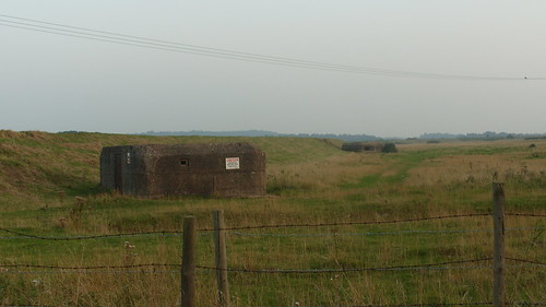
They look over the North Beach, in case the Nazis attack via The Wash. What two men in bunkers could have done against the Wehrmacht is a moot point.
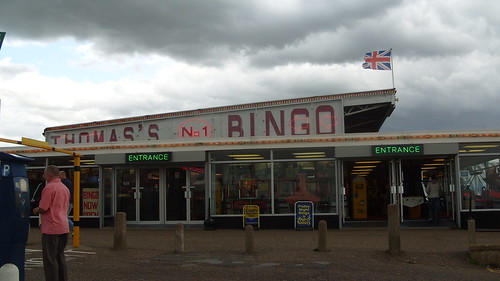
Three miles from Heacham is Hunstanton, a proper seaside resort, with Penny Arcades, shops called things like 'Geezer's Palace', amusements including arcade games of the mid-80s (Track and Field!), and so forth. Like all seaside towns it has gone to seed in an interesting way. At the seafront are curved concrete walls to prevent floods. Also like all seaside towns, concrete and Modernism are quietly, blithely acceptable, perhaps because the purpose is hedonism, however circumscribed, rather than English home-making.
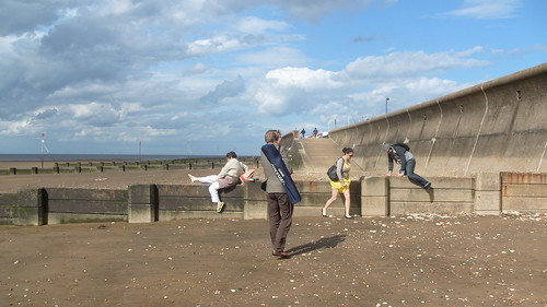
The most famous thing about Hunstanton, although it doesn't feature on the postcards, is a much less blithe kind of Modernism: the Hunstanton Secondary Modern School. Designed by Alison and Peter Smithson in 1949, while they were (remarkably) in their early 20s, it is as far from seaside jollity and all its cheerful crapness as could possibly be imagined.
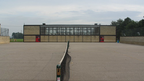
Practically anyone interested in 20th century architecture will have seen it in photographs, the water tower at the entrance and the severe geometries. 'The first New Brutalist Building', 'the most truly modern building in Britain'. This gives you absolutely no hint of just how wildly incongruous it is with the surrounding area. In amongst the bungalows and such, this sleek, ruthless object. The Smithsons spoke of the building having two lives - one as a noisy comprehensive school, 'and another life when the building is empty, a life of pure space'. Me and my sister go there on a Sunday. The gates are open, so we get the life of pure space. The 'found objects' element you always see in photos is the metal water tower, not the even stranger, even starker brick tower behind it.
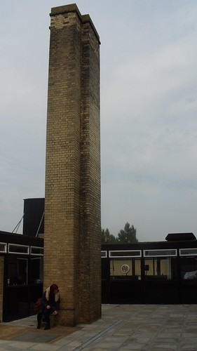
Yet it's just a secondary school. Its fame worldwide seems to accord with its obscurity in Norfolk. A perfect example of Welfare State ethics in its most extraordinary form - a sublime object dropped, seemingly at random, landing in the midst of an unremarkable English everyday. Now, of course, rather than being truly comprehensive it 'specialises' in Maths and Computing, in that offensive Blairite manner - something that polymaths like the Smithsons, enthusiasts for art, pop, science, philosophy, would undoubtedly have been depressed by - but Secondary Modern will always be the phrase associated with it, with the latter of the two words stressed.
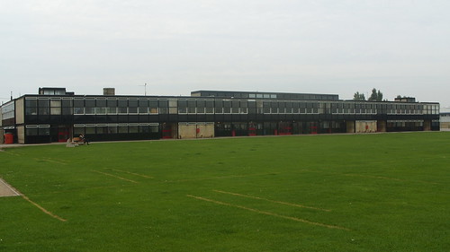
The length of the main block is almost a shock, the deliberate aestheticism and imposition. Without ever using the raw concrete that Brutalism would be known for, it creates the sense of power and force, the memorable image, that the style brought to Modernism. Even the additions, the black panels on the main block's windows (to stop the sea winds smashing them) seem to reinforce the buildings' domineering effect. All this at one storey high, with De Stijl colours and stock brick - pointedly not the local stone and ragged brickwork which features in so many buildings in the area, which itself seems a Dutch importation, has something rather continental about it.
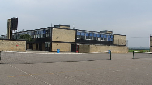
At the back are fields which seem to go on forever. The endless Norfolk flatlands, with barely a hill all the way to the Urals.


